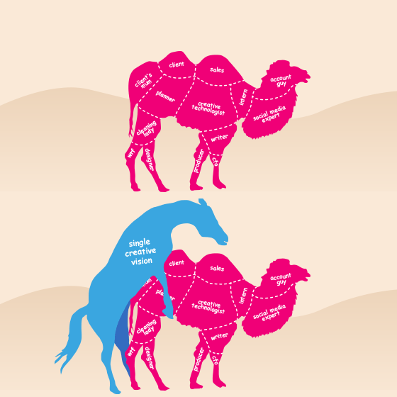
A camel is a horse designed by a committee. An expression critical of committees—or by analogy, group decision-making—by emphasising the ineffectiveness of incorporating too many conflicting opinions into a single project. In this figure of speech, the distinguishing features of a camel, such as its humps and poor temperament, are taken to be the deformities that resulted from its poor design.1 This is a proverb that would strike a chord with most designers. We’ve all been there at one time or another. You’ve received the brief from the client. You’ve scoured the net for amazing references, and you’re ready to burst out of the gates, fingers tingling with creative energy. You complete the first few pages of design, and present them excitedly, knowing that this will be the one. The one that wins you an AWWWARD. Then come the comments. At first, they’re small, and you’re cool with that. So what if they want the button to be more “pink”? I’ll tweak the overall colour scheme. We’re still on track here. Larger logo? Okay, I’ll have to increase the header height to accommodate the negative space/breathing room around the logo. We’re still on track here. Can I make the buttons bigger? Done. What? Even biggerer(sic)? Hmmm… ok. We’re still on track here. Then the comments start flooding in from all directions. Bob’s third cousin, Marvin, thinks that the image you have selected isn’t on brand. Wesley thinks we should have a Google+ logo on there. Carol in accounts thinks you should use Comic Sans for headings as it’s a ‘friendlier font’. CAROL IN ACCOUNTS?! All of a sudden, just like Dorothy, you’re whirled up in a tornado of widespread opinions and conjecture. Design is subjective, and annoyingly so. Now wait a minute, you pretentious, precious and delicate designer! Precious and delicate I may be, but I’m simply protecting my precious and delicate designs of which many hours, including my soul, have been poured into. The same designs that wake me at 3am. The same designs that keep me enthusiastically at my desk. The same designs that will win me an Awwward!  That’s what I used to think and believe. Moving beyond my own design ambitions, and finding empathy towards the client and product, was not easy. Over time, this ‘awakening’ had a major impact on the way I approached design, and armed me with the right set of questions to negate bottlenecks. Identifying the right people to be involved in a project, and receiving constructive feedback or critique is paramount. Just as long as they don’t invite their fair-weather chums along for the ride. I’ve learned to listen to what people are saying, and more importantly hear what they’re asking for. And as for the committee, I’ve made my peace. I think it’s more in the wrangling and handling of relevant people. The ‘committee’ long ago became a ‘team’, because I realised, and discovered I was missing valuable input and insights, and outside(objective) opinions. I was more concerned with my design being messed around with than goals being met. Initially, projects require the right people, not just anybody with an opinion. Feedback and critique is imperative, but it can be taxing to the project’s timeline and direction. People get cold feet, questioning their every decision. Best practice quickly becomes mass practice as people stay the safe course_._ Second opinions matter. Valuable insights, especially where user experience (UX) is concerned, come to light. When we consider a user experience, everybody’s opinion and view counts, but thankfully we have tools to test with, and analytics to pour over. A little camel is ok. These days welcoming feedback and critique from my peers helps rationalize the work, and some of the better outcomes I can’t take credit for. They’re usually a valued team member, with an experienced and objective point-of-view. Not Carol though. Comic sans?! *shakes fist at sky* Disclaimer Carol is a fictional character. Although, the request for Comic Sans did actually happen. Source 1. https://en.wiktionary.org/wiki/a_camel_is_a_horse_designed_by_a_committee Looking for a car? http://www.lingscars.com/


